In this article, you’ll learn how to build an FAQ page that your clients will love to read and your staff will love to reference.
We’ll also talk about:
- The importance of an FAQ page
- Examples of great FAQ pages
- FAQ page templates
By the end of the article, you’ll know how to build a perfect FAQ page to answer your customer’s questions and streamline your customer service process.
Let’s get started.
What Is an FAQ Page and Why Is It Important?
An FAQ, or “Frequently Asked Questions” page, is a space where a brand or company answers important information about their business that is of the interest of its clients and users.
The FAQ page usually plays an important role in clarifying information about common issues and processes and helps users satisfy their curiosity and solve issues by themselves.
FAQ pages are incredibly important to save time for both users and employees. Users will typically contact customer support after trying to find answers to their questions themselves.
FAQ pages can also increase customer value by answering customer questions as quickly as possible, without long phone waits or interaction with representatives.
A good FAQ page increases customer success by giving the user the agency to answer their questions and letting employees focus on issues that users can’t resolve by themselves.
How to Build a Great FAQ Page
Here’s how to build a great FAQ page, step by step:
Step 1: Choose which questions you’ll answer
Although this step sounds obvious, it can easily be overlooked. A good FAQ page will have questions that are frequently asked and must avoid including unnecessary information.
A great way to do this is by using real data. If you have a log of customer interactions, look at the most common reasons clients call.
Involve your customer service staff by asking them which questions they answer the most and what issues are the most common.
Once you know what questions need to be included, identify the areas they belong to so you can organically answer questions related to common queries.
Step 2: Write compelling answers with your user in mind
You and your coworkers don’t talk the same way your customers do. You will always know more about the product and the ins and outs of your company than your customers will. You have your own lingo and style of communicating.
A good FAQ will avoid using this lingo and will provide answers in the language of the customer.
Don’t waste time telling customers how the company works if they don’t need to know. Keep your answers on a need-to-know basis.
Skip introductions and answer questions as simply and to the point as possible. If your customers want more information, they can search other questions in your FAQ.
Step 3: Include a live support option
While your FAQ page may be your users’ first stop, not all users will find the exact information they’re looking for. No FAQ can answer every question from every customer.
Instead, give them the option to contact your customer service team if their query extends beyond your FAQ’s focus, so they don’t need to search for your phone or email info elsewhere.
Install customer service chatbots directly on your FAQ page so your reps can help users solve their questions.
Finally, use targeted messages to capture users who have more questions, to put them in contact with a customer support rep.
Step 4: Make your FAQ page easy to find
Now that you have a good FAQ page, you want your users to be able to locate it quickly.
Most websites list their FAQ page either in their footer section, main menu, or sidebar. You can also include it in email footers and promotional material.
Make sure your clients can always find help when they need it.
Step 5: Keep tweaking your FAQ page
It’s important that your FAQ page is continually updated to reflect your users’ changing needs and your company’s evolution.
Use a data-driven focus to discover common user questions relating to new products, services, or events, and add those to your page.
Audit your FAQ page as frequently as needed to ensure it is up to date with both your company and your customer’s needs.
15+ Amazing FAQ Page Examples You Can Learn From
Here are more than 15 examples of amazing FAQ pages and what you can learn from them:
1. Productivity Software Companies
Productivity software companies develop solutions for their clients to produce documents, databases, presentations, and other digital products.
Here’s how they handle customer questions:
LibreOffice
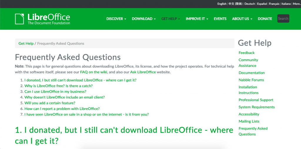
LibreOffice is a free open-source office suite, similar to Microsoft Office, which includes programs for spreadsheets, presentations, word processing, and more.
Because it offers so many free products, LibreOffice dedicates its main FAQ page to general questions about the office suite rather than technical questions about its products.
This allows the company to have a very comprehensive question database that is easy to navigate and answers the right questions.
Use this technique:
Identify your users’ pain points to find out if you need more than one FAQ page. If your company is too large to answer people’s questions on one page, divide the topics into different pages such as one for general questions and one for troubleshooting.
Microsoft
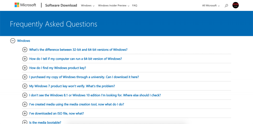
Microsoft’s FAQ page is surprisingly minimalistic. This practical page is divided into “Microsoft” and “Office” drop-down menus. Users can quickly locate answers to their questions and organically navigate to the solution without requiring a search bar.
Use this technique:
Make your page as easy to navigate as possible. Search bars don’t always work properly, and it requires a lot of time to make them fully functional. If your design is simple and easy to navigate, you may not even need one.
Adobe Creative Cloud
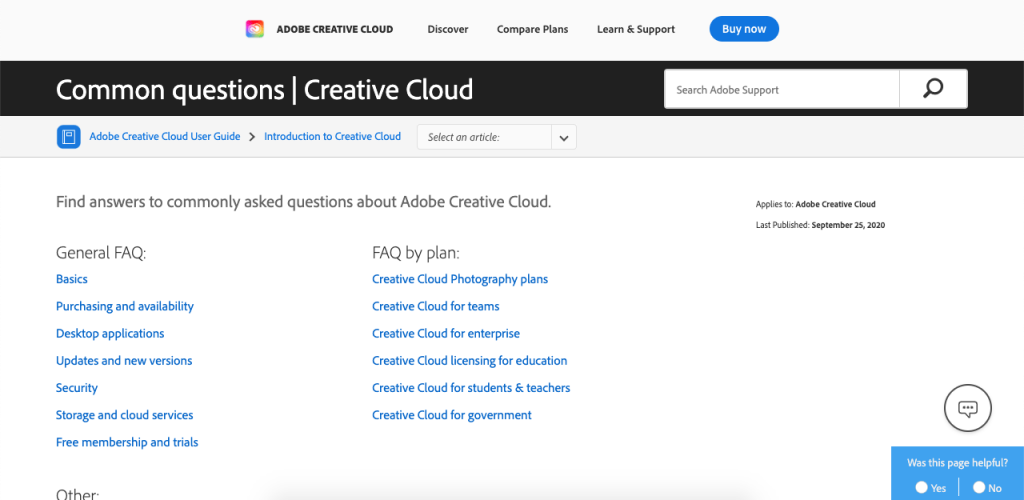
You can search through Adobe Creative Cloud’s FAQ page in two different ways: by using the search bar or by using questions with drop-down answers.
Since there are plenty of questions to answer, Adobe summarizes topics to make browsing as easy as possible.
Use this technique:
Like Adobe, you may not always want to start with questions and answers. Instead, let your user choose the topic they need to learn about to begin their search.
accessiBe
What sets this FAQ section apart is that it doesn’t feature expandable, drop-down sections. Those might be difficult for certain people with disabilities. And, since this site is designed to help people test their website for accessibility, the FAQ section needs to be consistent with that.
2. Social Media Platforms
Social media platforms need to be able to answer many questions from many users.
Here’s how they do it:
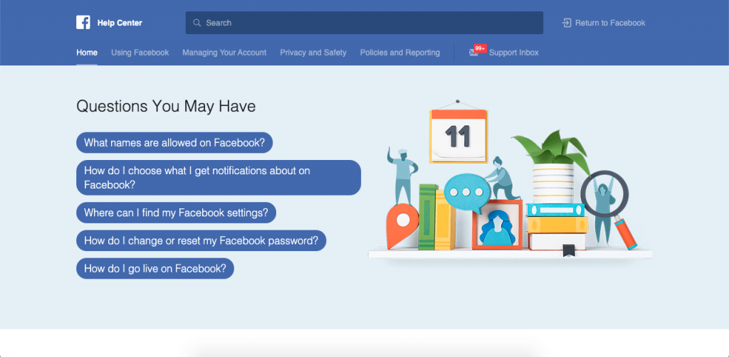
As the largest social media platform in the world, Facebook surprisingly starts its FAQ page with just five questions.
Users can scroll down to find popular topics along with the Help Community and Business Help Center.
This minimalist approach makes the FAQ page very easy to navigate in spite of having a lot of information in it.
Use this technique:
If your data shows that a small number of questions are being disproportionately asked, place them front and center on your FAQ page to make sure they are answered first.
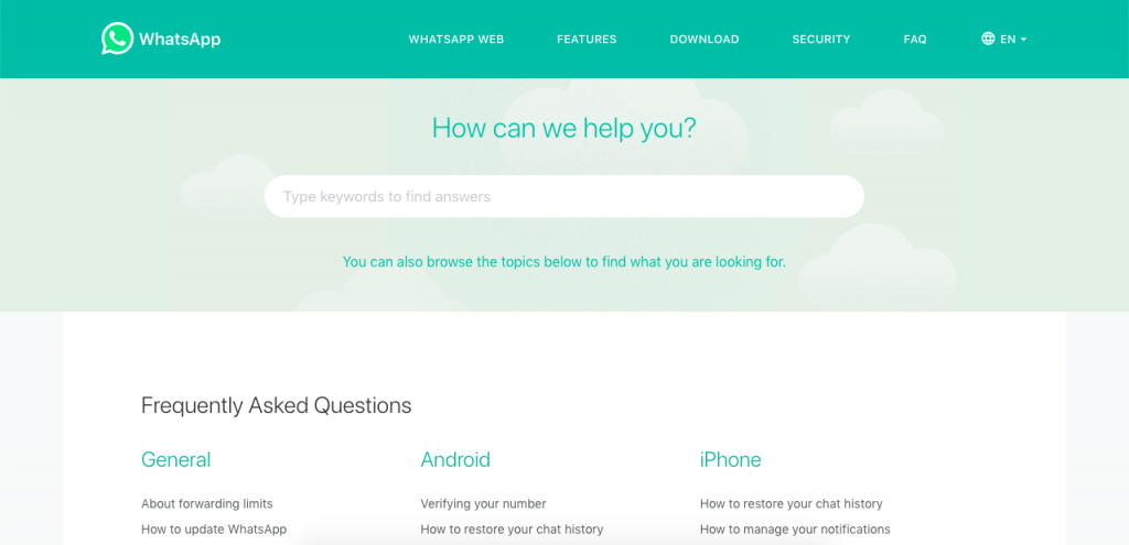
If you were to describe WhatsApp’s FAQ page with one word, it would be “soothing”. The FAQ page is designed with soft versions of the WhatsApp color palette, with a soft green color scheme and the search bar placed literally in the clouds.
This FAQ page is very simple to search through, but the browsing experience isn’t just fast, it’s relaxing.
Use this technique:
Often, users will use your FAQ page to solve an issue that may be stressing them out. By favoring an FAQ design that is simple, easy to browse through, and soothing to look at, you can counteract the stressful experience of trying to solve an issue.
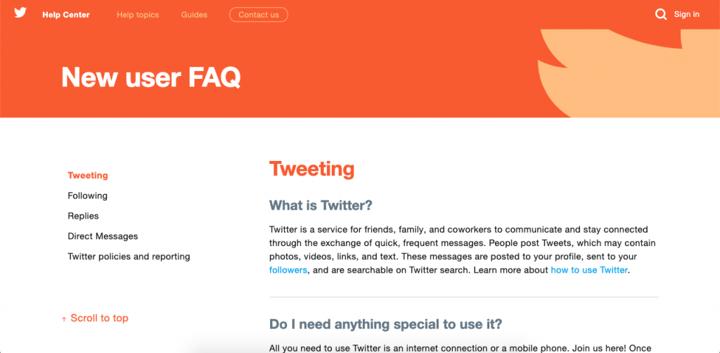
Twitter’s FAQ is striking and smartly designed. The main topics are color-coded: blue for basics, green for account management, deep pink for safety and security, and orange for rules and policies.
This color-coding approach visually divides different segments and can be used as a visual link between similar topics.
Use this technique:
Many FAQ pages are just boring lists of questions and answers with a design that looks like an afterthought.
If you want to engage users, pay attention to your page design. Make it engaging and visually appealing. Users will appreciate the extra effort made to answer their questions.
3. Online Payment Providers
Unlike many other industries, questions about online payment systems are very important since they handle people’s online assets.
Here’s how they answer their frequently asked questions:
PayPal
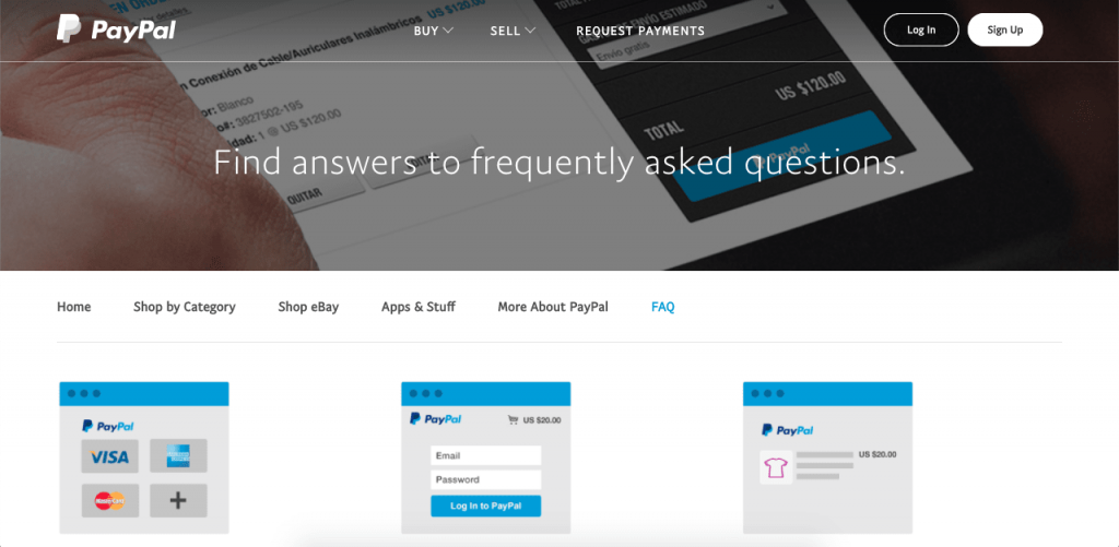
As one of the most commonly used online payment systems, PayPal users often encounter pressing issues that need immediate answers.
Since PayPal knows users’ questions often involve their personal accounts, the FAQ page is simple and only answers 10 basic questions. One of the questions links users to the Help Center, where they can speak with representatives about their issues.
Use this technique:
Don’t try to answer every single question every user may have. Instead, plan the scope of your FAQ page in advance, and make it easy for people to contact your team if they still have unanswered questions.
Payoneer
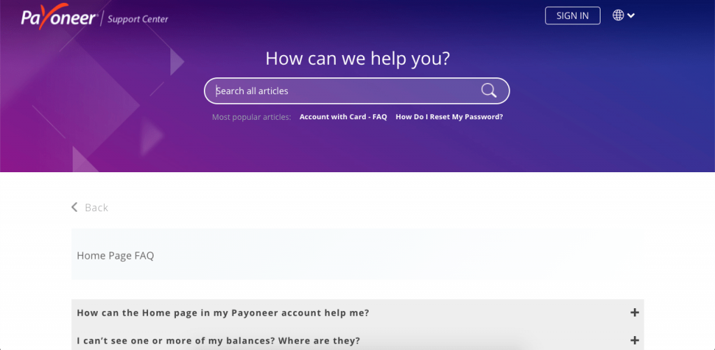
Payoneer, like PayPal, has a reduced number of questions and answers listed in its FAQ. However, once users scroll down to the end of the page, they encounter two more ways to get answers to their questions: by reading the blog or asking the community.
Use this technique:
FAQ pages shouldn’t be your only method of answering users’ questions. Use your FAQ page to link to other pages of your website where users can find the information they’re looking for.
Skrill

Unlike most other websites, Skrill doesn’t open their FAQ page with a list of questions. Instead, you’re greeted with a search bar, inviting you to ask your question. It’s only when you scroll down that you see the four main topics, and even then, you’ll have to click on them to find relevant questions.
Use this technique:
You need to avoid overwhelming your users. Instead, look at your analytics and learn how your users like to navigate your FAQ page. Develop a streamlined navigation process based on their preferences, and place it front and center.
4. Online Retail Stores
Online retail stores often have two very different user personas: buyers and sellers. Their FAQ pages are usually divided into at least two areas.
Here’s how they do it:
Esty
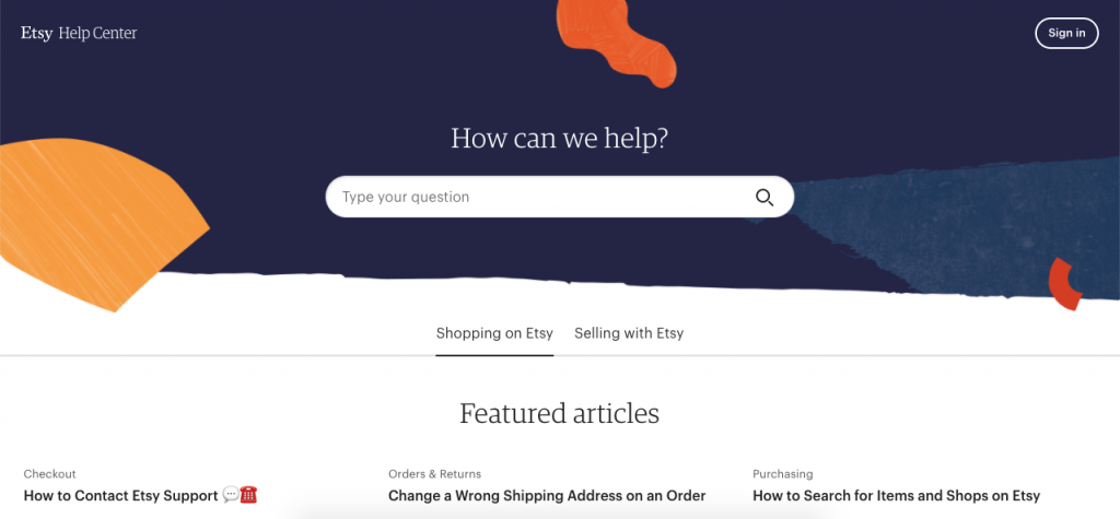
As one of the most popular online retail shopping centers, Etsy has a huge number of questions and answers to help guide its users through multiple processes.
To achieve this, Etsy’s FAQ page provides answers to questions as quickly and simply as possible and lists related questions so users can keep learning.
Use this technique:
Instead of having broad questions answered in multiple paragraphs, break down your questions into smaller topics. Develop a strong data-based interlinking strategy to list related questions.
This will help your users find exactly what they’re looking for without the hassle of reading about issues they don’t care about.
Shopify
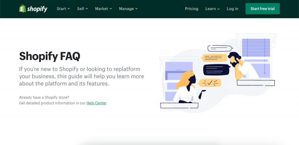
Contrary to Etsy, Shopify’s FAQ page is so simple that it doesn’t even have a search bar. Instead, it answers only 14 questions, which you can read through in a couple of minutes.
How does Shopify get away with this?
They simply link their Help Center to anyone who already has a Shopify store. This allows them to clearly filter questions from external users, who generally require simple answers, from client questions, which are often more complex.
Use this technique:
In some cases, you may decide that an FAQ page isn’t the best way to answer clients’ questions, especially when their questions are better answered through a Knowledge Base.
If this is the case, simplify your FAQ page and be sure to link your Knowledge Base for your advanced users. You can also check out how other Shopify stores are handling it.
Amazon
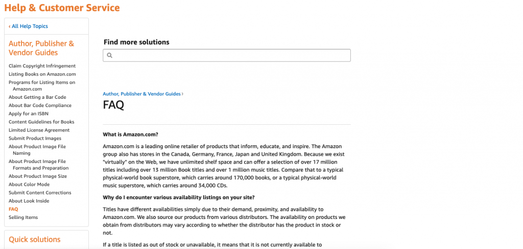
Although Amazon’s FAQ page isn’t the prettiest page on this list, it is still very functional. This is achieved by creating unique FAQ pages for different topics as narrow as Amazon Prime Phones or Author, Publisher, and Vendor Guides. It then explains everything the user may want to know about that specific topic in great detail.
Use this technique:
Sometimes, a user may only want to find answers to questions about one specific topic.
If this is your case, be sure to properly divide your FAQ page to answer questions with the information these users already have, using the right context.
5. Freelance Platforms
Many professionals use freelance platforms to find ways to support themselves. Since these platforms handle users’ livelihoods, their FAQ pages need to be well designed.
This is how they do it:
Upwork
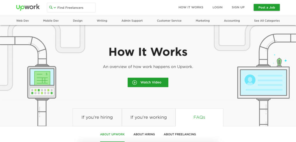
Along with the fun design, UpWork’s FAQ page is notable because of how it is divided. The FAQ page covers basic questions about freelancers, hiring, and the platform itself.
These questions aren’t meant for people who are already using the platform. Instead, the questions are meant for potential users, since members already have access to tailored knowledge bases.
Use this technique:
Sometimes, FAQ pages work better to answer potential user questions while knowledge bases are better for helping current users. Be sure to build both, especially when your solution involves an online account.
Skyword
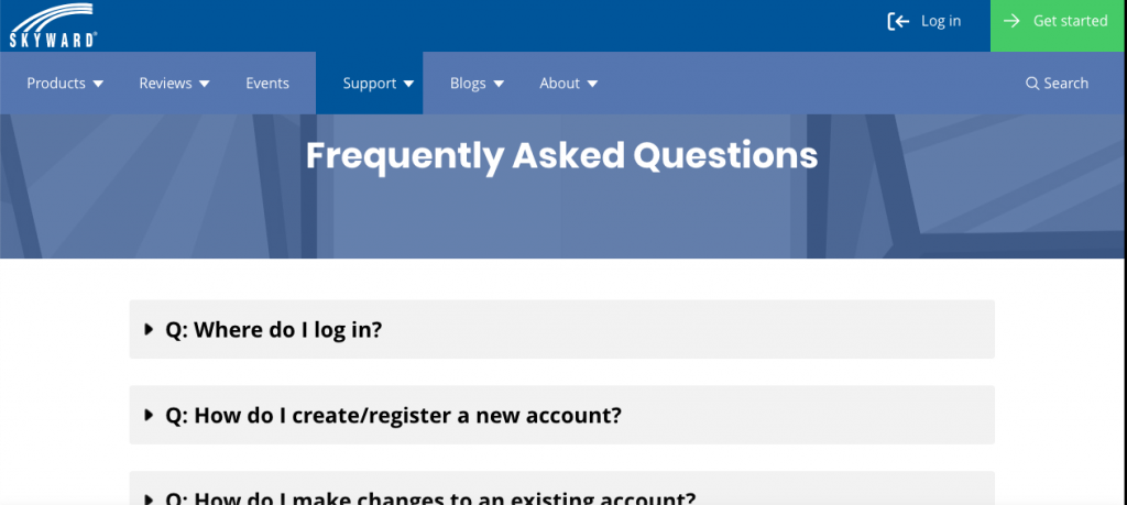
Skyward only answers five questions on its FAQ page. Although at first glance, this may seem like too few, two out of those five questions redirect users to its Family Access Toolkit, its training options, and its customer support options.
This approach lets Skyward capture and redirect the right users to the right tools.
Use this technique:
Use your FAQ as a jumpstart for your users. Give them the information they need to use it as a divider of traffic, redirecting the right users to the pages they need, whether this is on the FAQ page or outside of it.
6. VPN Sites
Since VPNs are all about security and are not fully understood by many users, VPNs need to answer many questions about how they work and how well they’ll protect user information.
Here’s how they answer these questions:
StrongVPN
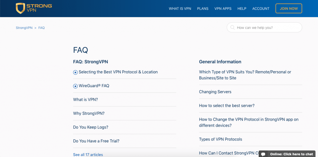
StrongVPN divides its FAQ into four areas, and its questions range from one-paragraph answers to fully-fledged tutorials with images and videos.
This allows users to solve their questions, even when they need to absorb a lot of information.
Use this technique:
Although you should always aim to be as brief as possible, you should never cut out important information for the sake of being brief.
Instead, use images and videos to help your users learn as much as possible without forcing them to read large blocks of text.
NordVPN
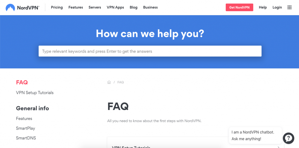
An increasingly popular option, NordVPN is growing thanks to its heavy influencer focus, which allows it to direct a large amount of traffic to its website. These potential users, however, are not always educated enough to become clients.
To counteract this, NordVPN uses its FAQ page to answer questions that potential clients may have. The front page answers questions about Smart TVs, servers, and devices, which are all selling points that its influencers commonly use.
Use this technique:
NordVPN is a great example of how important it is to know your user personas and cater to their needs. If you have a great influx of inexperienced users, you can use your knowledge of user personas to write answers to questions they don’t even know to ask yet.
Best Practices for Building a Better FAQ Page
Here are a few tips and best practices to keep in mind while building an FAQ page:
Keep it simple
As we’ve seen, the most successful FAQ pages are pages that answer questions as briefly as possible.
An FAQ page isn’t a place to upsell services, crack jokes, or sell users on your platform. Avoid slang and don’t write answers that create more questions.
Instead, write simple, short questions, and answer them immediately.
Use data to start and to improve
The best way to learn which questions you need to add and how you need to answer them is by guiding your decisions with data.
Data will not only tell you where to begin, but it will also tell you where you can improve. Check the analytics on the most visited pages to find more topics requiring further explanation, and constantly audit your FAQ page to update it and remove obsolete information.
Use your brand’s personality
Although you should keep your FAQ page clear and concise, you can still use it to flesh out your brand’s personality.
Pay close attention not only to the tone you’re using but also to the design of the FAQ page, to make sure everything in it is consistent with your brand.
5 FAQ Page Templates You Can Use For Every Situation
Here are a few FAQ page templates to get you started:
Shopify FAQ Page Template
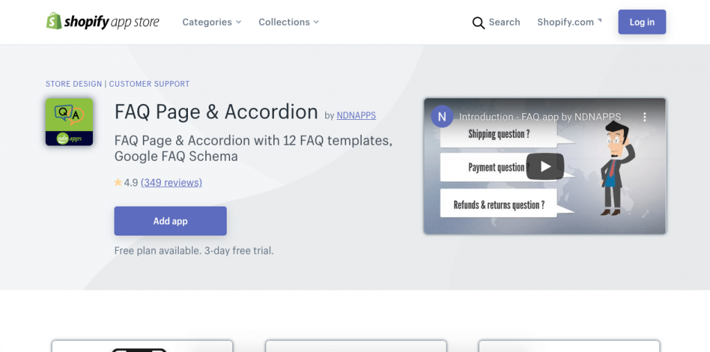
Shopify’s template has the benefits of all Shopify’s teachings about e-commerce. Its FAQ template is as simple to build as its stores and helps you cover your basis by answering any questions your customers may have.
This template is especially useful for e-commerce and online businesses that need a beautiful, highly-functional page—without the coding.
Bootstrap FAQ Page Template
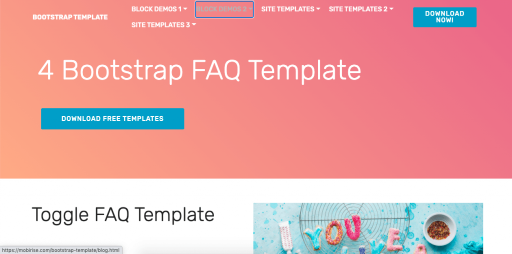
Bootstrap gives you four FAQ page templates for free to integrate into your site. Like the rest of its templates, the FAQ page templates are visually appealing, easy to edit, and ideal for users who don’t know how to code.
Typeform FAQ Page Template
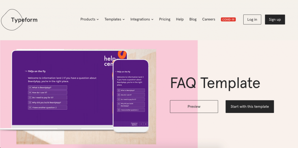
This simple template by Typeform is incredibly easy to edit and customize to your needs. With powerful integrations, Typeform lets you gather the data you need from the platforms you’re already using to create FAQ pages that work well on any device.
HTML FAQ Page Template
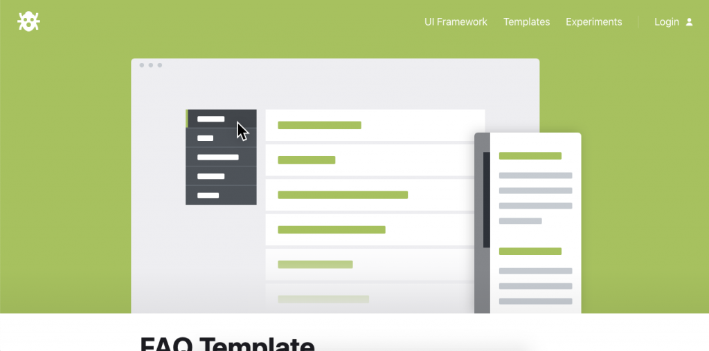
If you already know about HTML, this FAQ template by Codyhouse is a great place to start.
The template is perfectly coded, easy to edit, and completely free—no registration required.
WordPress FAQ Page Plugin
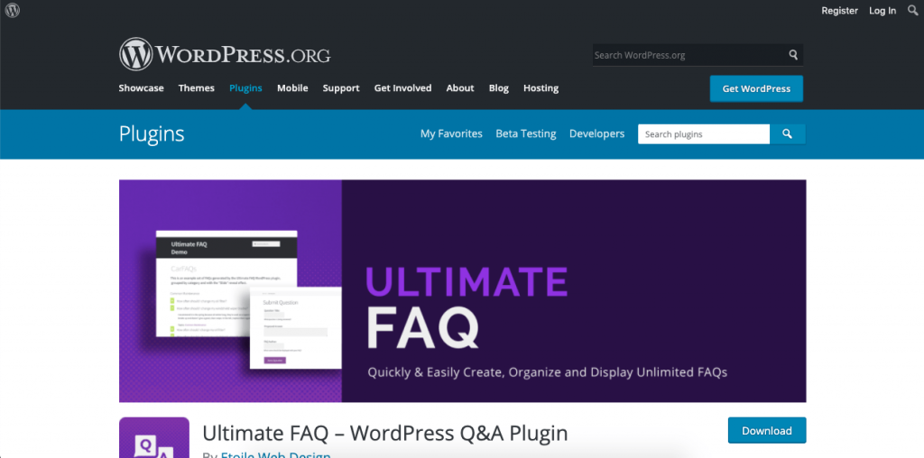
The Ultimate FAQ plugin allows you to create your FAQ page the way you want it, with dropdown menus, product-related questions, and many layouts to choose from.
This is a great choice for anyone already using WordPress for their website.
Frequently Asked Questions
Here are answers to the most common questions about FAQs:
1. What should be included in an FAQ page?
The ideal FAQ page should answer any and all questions your typical user may have. It should also include links to relevant pages across your website.
2. Do FAQ pages work?
FAQ pages work because they give users the agency to solve their own queries, making the whole process faster for them and letting your customer service team focus on delivering great service to the users who truly need it.
3. How do you format an FAQ document?
The right format will cater to your individual brand and users. A well-formatted FAQ page allows users to find answers to their questions quickly, prioritizing their most common questions to expedite their results.
4. Why is FAQ important?
FAQ pages provide your users with all the information they need about your brand, your company, and your product. They also boost your link-building and can even help with your SEO.
5. How do you answer FAQs?
In answering your FAQs, get straight to the point and use the language of the reader.
6. Are FAQ pages good for SEO?
FAQ pages can improve your SEO ranking through interlinking and by answering common user queries directly on the website.
Conclusion
FAQ pages allow your users to find the answers they’re looking for as quickly as possible.
A well-designed FAQ page can boost customer loyalty, decrease customer service time, and even help your website rise in SEO rankings.
If you design a good FAQ page, your business and your customers will thank you.






 Instagram