An aha moment is a powerful feeling. It can drive your customers to research your product and relentlessly find a way to buy it.
And when they get it, they will be ready to be loyal to your company. In fact, they’ll enthusiastically wait for your next product.
So what’s an aha moment in marketing? And more importantly, how do you create one?
What Is an Aha! Moment? (And Why Should You Care?)
An “Aha! Moment” is an instant that produces a sudden realization. It’s when you finally make a discovery you’ve been looking for. And in marketing, it’s when your user discovers they need your product.
An aha moment can be very impactful. Think about the last time you saw something (such as lan amazing gadget or a creative invention) and thought to yourself, “I need that in my life.” You probably even went and looked it up, in order to try and get more information about the product, including who sold it, and how you could get your hands on it.
The best part? You can get potential customers to have that same realization about your product.
When perfectly crafted, your users can have a powerful aha moment that drives them to buy what you’re selling. This moment usually happens during onboarding: They realize why they need what you’re selling.
But crafting this moment isn’t just a matter of showing potential users your product and telling them what it can do for them. To create a powerful aha moment, you need to know who your customers are and perfectly craft a marketing strategy that caters to their pain points.
After all, if you want to create a sense of urgency in your customers, you need to start by knowing what amazes them.
5+ Aha! Moment Examples to Check Out
These five companies have perfected the craft of creating aha moments for their potential customers…
1. Trello – Welcome Board
Trello is a platform for project management. Its main appeal is its simplicity. It makes it easy for users to organize and prioritize their projects. Trello knows each potential user is looking for a solution that’s quick and intuitive. That’s where the Welcome Board comes in:
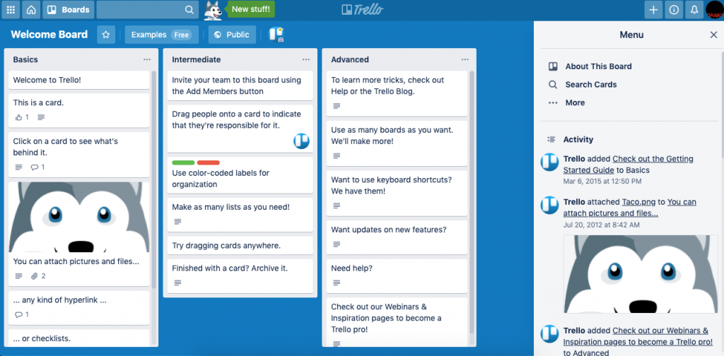
Trello’s Welcome Board is the equivalent of a “Try Me” sign on a toy. Just like kids can’t resist trying a new toy before they fall in love with it, Trello’s Welcome Board showcases its product and lets users interact with it and fall in love with it.
The Welcome Board asks you to click on it, drag tasks across lists, and truly make them your own. Trello knows this rule of thumb: If users interact with the board, they’ll probably have an aha moment when they realize how easy it is to use and how much value they can get out of it.
Once the aha moment happens, a signup is inevitable.
2. Netflix – Recommendations
When Netflix first started as a streaming service, it offered what no one else did: endless content on demand. However, they knew their users would quickly get overwhelmed.
So they created their recommendation engine.
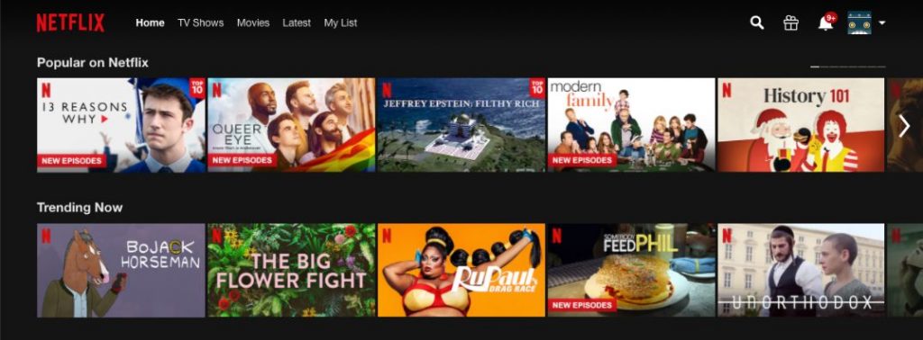
Netflix creates its aha moment by giving the user something to watch in less than a minute. It uses an algorithm to determine what’s trending and popular, and it gets first-time users watching something as quickly as possible. Once the user is hooked, it’s easier for them to come back and keep discovering content.
Netflix then capitalizes on this opportunity by making the algorithm adapt to the user. The more they watch, the better it’ll choose content, in order to suggest watching options.
So this tool is a great example of the way an aha moment can be used—not only to get prospects to convert, but also to get them to stay loyal to your company.
3. Buzzmo – Homepage Demo
Whereas Trello chooses to get their aha moment when its users are browsing it, Buzzmo chooses to turn it into the first thing users see.
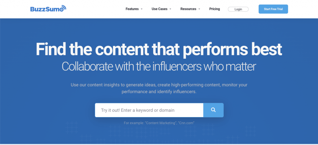
As soon as you go to Buzzmo, you’ll be able to interact with its features—without even having to scroll down.
By letting marketers immediately interact with its features, Buzzmo can craft its aha moment to position itself above the competition. Once a user signs up, Buzzmo knows their expectations and can fulfill them
4. WeChat – Versatility
With over one billion monthly active users, WeChat is more important to Chinese users than any app is to American users. It crafted its aha moment with one goal in mind: making life easier for its users.
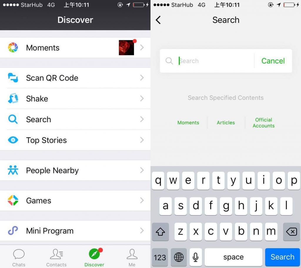
As its name implies, WeChat isn’t only intended to message other users. Almost half of its active users have bank accounts tied to WeChat, which allows them to use the app for mobile payment.
And with WeChat’s “mini-programs” (aka apps within the app), companies can combine its messaging and payment capabilities, in order to get the users to interact with them. Users can then book flights, make doctors’ appointments, get food delivered, and even play games—all within the app.
WeChat crafts its aha moment by giving its users a huge amount of versatility. The more users they get, the more companies will interact with it. And the more companies they get, the more impactful their aha moment will be for new users.
5. Close – Sample Data
Close is a CRM system for reducing data entry, in order to help increase user productivity. However, the team behind it noticed that getting new users to see its potential would be challenging. The CRM is built around data, and new users wouldn’t have enough data ready to visualize what it could do for them.
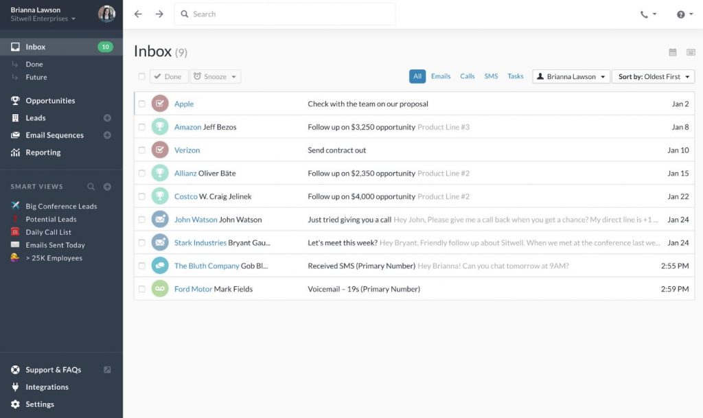
So Close found a great way to solve this problem. Once a user has signed up, they’re taken to a contact screen. Close has already kept track of the user’s activities, so the tool is already loaded with sample data that caters to their needs.
Closecircumvents the need for data and gives new users their aha moment by showing the full potential of the platform—even when the user is just starting out
How to Find the Aha! Moment for Your Product
Here’s a step-by-step method for finding your users’ aha moment…
1. Ask Your Current Customers
Whether they’ve realized it or not, most of your current customers have already found the aha moment, which will lead them to try out your product and come back for more. However, you need to focus on the right one and know how to ask them for it.
To make sure your customers remember their aha moment, focus on new users. Send them a survey, in order to find out when the moment happened.
Ask questions like:
- Which feature grabbed your attention?
- What’s the main reason you decided to purchase?
- How has our product helped you?
- Did you feel lost when you got started?
- How quickly did you get the hang of it?
Once you have their answers, examine them and look for themes, such as the most attractive features, the most common pain points, and reasons to stick around.
Remember: Aha moments may not be the same with every single user. So make room for a few aha moments via different user segments.
2. Examine Your Data
The best way to complement your clients’ answers is by pairing them with relevant data. This tactic can give you a full picture of your users’ journey and give you the insight you need.
Use your product data to find out when your users convert and why. Validate your clients’ answers with the data, in order to nail down the aha moment.
In the data, look for answers to questions like these:
- When converting clients, how important is the onboarding experience?
- How many converted clients interacted with the main feature you provide?
- How many times did a user come back to your product before converting?
- What was the last thing users interacted with before converting?
Next, compare the data to users that didn’t convert, in order to find the user behavior that leads to conversion. You may find that the main differences between users that converted and ones that didn’t include the features they interacted with, their onboarding experience, or their contact with your customer service team.
To explain where the aha moment is, map out your user behavior and craft hypotheses.
3. Take Action by Testing a Theory
Once you have your data-based hypotheses, it’s time to test them!
The best and most reliable way to test your hypothesis is via an A/B test. Simply divide users into two groups, and present them with two different paths towards the aha moment.
Say you discovered that the main trend of conversion is one of your product’s features. With an A/B test, you can find out how well users convert when this feature is the first thing they see on your website (as opposed to its current location).
For tests to work properly, make sure you’re accurately segmenting your audience. If you’re testing two different potential approaches, make sure you keep a control group, in order to account for external factors.
Your main goal isn’t to get as many opens as you can. Instead, focus on finding out how many users reach conversion.
Testing is a crucial part of your process. To finetune their path towards their aha moment, repeat the process of examining customer behavior, and test potential improvements.
How to Help Your Users Reach Their Aha! Moment
Here are a few ways to help your users reach their aha moments, as well as ways companies are applying these methods:
1. Personalize Your Users’ Journey
As we’ve mentioned before, different user personas may have different journeys that will lead to different aha moments.
So you need to personalize their journeys, instead of aiming for all of them to go through the same one. The better you personalize them, the more users you’ll help reach their aha moments.
Here are a couple of ways to segment your users:
- Actively segment via data.
Compartmentalize your users, depending on the data you have on them. With this information, you can group together similar users according to their demographics, including their ages and physical locations.
- Let your customers choose their own paths.
When you put your users in control, they can choose where to go and how to interact with your company. If you give users control over their paths, you won’t need to recollect data. However, you will need to craft different paths that work well together.
How it looks like in action:
Since Canva doesn’t have users’ data when they sign up, it lets them segment themselves by asking them to choose what best describes them:
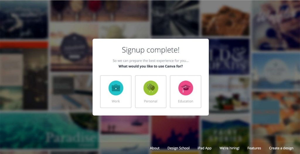
This tactic occurs immediately after signup (which takes a few seconds). It helps their users narrow down what they want out of Canva by choosing one word out of three.
If someone selects “Work,” they’ll be presented with templates for presentations and business cards. But a user who selects “Personal” will be shown templates for birthday invitations and Facebook posts.
Canva knows that their users’ aha moments will happen as soon as they see how easy it is to create flyers, posts, infographics or whatever they want to create. Then it uses this simple segmentation to get users to create their idea as quickly as possible and show them all of the possibilities it offers them.
Steal this idea:
Segmentation doesn’t have to be hard. If you’re letting users segment themselves, ask them to choose their path in a very straightforward, direct, and fun way.
Then deliver on your users’ expectations by making sure each path is perfectly crafted towards each user’s goals.
2. Increase User Engagement
The longer your users interact with your website or product, the better the chances will be that they’ll reach their aha moment. That’s why increasing customer engagement is vital for the conversion of your users.
To accomplish this goal, you need to give your users reasons to keep interacting with your company. Show them how life looks like when they use your product. Give them the chance to discover how it can make their life better. Let them interact for as long as they want with it, until they figure out why they need it.
This process will look drastically different for each company, and even for each user persona. So you need to know as much as your users, in order to perfectly craft an engagement user path.
How it looks like in action:
Snapchat’s aha moments can be boiled down to two options: their real-time filters and their self-destruct messaging. If a user isn’t convinced when reaching their filters, Snapchat needs to get them to use the self-destruct feature, in order to reach their aha moment.

This goal is achieved by immediately grabbing the user’s attention until they complete their journey. As soon as you open Snapchat, you’re greeted with your camera’s selfie point of view. From there, you can select any filter to see how you’d look with it.
For multiple users, this filter creates the first aha moment. However, this journey keeps its other users engaged until they reach Snapchat’s second aha moment.
As users interact with the filters, they’ll find one they’d like to send to their friends. The moment they take a picture with it, the next screen automatically appears, which features the user’s contact list. Once they send the list, the app lets them know that their photo will self-destruct, giving their audience a second chance to reach their aha moment.
Steal this idea:
The simpler your product is, the fewer paths there will be for a user to reach their aha moment.
So keep them engaged, and give them a few chances to organically reach their aha moment while they’re interacting with your company.
3. Get Users to Reach Their Aha Moment Faster
Users want to learn from your company as quickly as possible. The more signups, installs, and surveys they have to go through before experiencing your product, the less they’ll want to reach it.
Sure, you may want the most amount of data out of them, in order to get them to craft the solution that’s perfect for them. But you’ll be risking losing users in the process. So you need to prioritize a user’s aha moment when crafting their journey.
Increase customer success by letting your users interact with your company, and give them as much as possible for free before asking them to sign in or fill out a questionnaire.
Remember: Once your users reach their aha moment, they’ll be more than willing to jump through any hoops to get your product.
How it looks like in action:
Airbnb requires a lot of information from its users when they sign up. But this platform also knows that its users want to visualize themselves staying in an amazing place. So it gives them the chance to browse through all listings before it asks for any information:
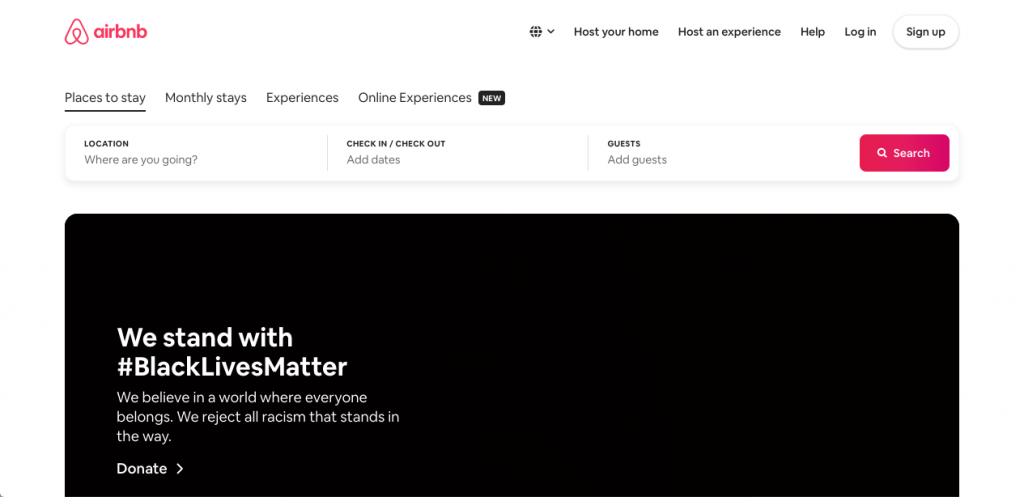
That way, Airbnb allows users to look up where they want to go and get to their aha moment—by finding a unique stay they won’t find anywhere else.
So once Airbnb asks for all their personal and billing information, users will be happy to give them away and spend time signing up—because they already know that’s the last step to getting their dream stay. Some users may even rush through the signup process, in order to make sure no one else gets their chosen stay first!
Steal this idea:
Give users a reason to jump through hoops to get what you’re offering—by leading them to their aha moment first and asking for information later.
Perhaps you know you lose people at a particular time along their customer journey, but you can’t remove this step. If so, place your aha moment ahead of it. That way, you guarantee a good customer perception and more effectively lead customers to conversion.
4. Communicate the Value You Provide
Sometimes the usage of the product alone can help a customer reach an aha moment, but it’s also worth considering telling them explicitly what they have achieved, or the value that they have received.
Consider the likes of Amazon Prime, not many people will remember how much they have saved on delivery, or how many hours they saved on shopping around. Amazon has the data on that and already display this data when you go to cancel.
This can be applied more broadly though – imagine if they showcased it to the user more often in their user journey so they can think ‘aha!’ when they see that there’s a tonne of value that they maybe hadn’t even thought about yet.
This kind of data visualisation in a software product can be easily created using existing data and one of a range of embedded analytics tools.
Steal this idea:
If you don’t have specific data on how much you have saved a customer, or what the business impact might be for them. You can use proxies. Consider estimating what they might save in time/money/effort or use other customers as a reference point.
Conclusion
Your customer’s aha moment is probably the most powerful, memorable part of their customer journey.
Now that you know how to craft it and where to place it, your customers will be more likely to convert. And they’ll have a better experience!




 Instagram