In this article, we’ll go through everything you need to know to write good welcome messages, and we’ll show you some great examples of welcome messages in practice.
We’ll also talk about:
- Why welcome messages are so important
- Best practices for coming up with welcome messages
- What you can learn from the best messages
By the end of the article, you’ll be able to write amazing welcome messages to maximize conversion and engage with your users.
Let’s get started.
What Is a Welcome Message (and Why Should You Put Emphasis On It)?
Welcome messages or welcome emails are usually defined as the first form of communication with your audience and are used for greeting, onboarding, or to let people know how to get in touch with you.
While their main purpose may differ, welcome messages are vital to your audience. They’re extremely important for setting the tone and can make the difference between engaging with people or losing them.
Welcome emails average a 50% open rate, which means that they’re opened at a rate that’s 86% higher than other marketing emails. Using that initial boost of attention is great for onboarding your users and leading them to the best course of action.
Welcome messages also increase engagement and are extremely affordable, making them a highly-valuable customer support tool. For those who rely on WordPress for e-commerce store, using WooCommerce email customizer to customize welcome email templates is highly recommended.
Where Does the Welcome Message Fit Into Your Onboarding Flow?
The welcome message should always come at the start of your onboarding flow. How close or far from the start will depend on the purpose of your welcome message.
Welcome messages from chatbots, for example, are used right at the beginning of the process. As soon as your user opens your website, they’re greeted with a welcome message, letting them know where to go to ask questions and start a conversation.
Some users may even engage with these messages immediately, making them the first course of action they take on the website.
Welcome emails don’t happen as early in the process. They’re usually sent after a user has already completed at least one action, such as subscribing to your newsletter or signing up on your website.
Since the user may have already taken a few steps before reaching the message, it can include more information. Instead of a quick sentence, it can have two or three potential actions for your user to take to get started with their onboarding process.
How to Write a Welcome Message: Here’s What You Need to Know
Here are a few tips and tricks to make sure your welcome messages are on point.
1. Know Your Audience
Before even writing the first word, you need to know who you’re talking to. Start by defining your user persona and making sure that persona is still relevant and up to date. Then, determine what those users need from your welcome message.
If it’s a chatbot message, what does the user persona need in order to decide to engage with it? If it’s a welcome email, what’s the most important information you can include? What are the next steps for them in the funnel?
The better you know your audience, the faster you can lead them to their aha moment, even through a welcome message.
2. Be as clear as possible
If there’s one thing you want your welcome message to have, it’s clarity. Your users should always understand why they’re receiving that message and know what they should do next.
If you’re writing a welcome email, tell the receiver who you are as quickly and clearly as possible and explain what makes your company stand out. You can do this through your words and also through your design.
3. Write with your user in mind
While you may want to go on and on about your company, that may not be your user’s main interest.
Don’t make the message about you, make it about them. What can they get out of this interaction? Why should they continue to receive your emails? Why should they open that chatbox widget and type in a question?
Cater to their pain points to make sure your audience interacts with your messages.
4. Keep it simple
Finally, your message should be as simple and easy to read as possible. Don’t use two sentences when one would suffice. Don’t use technical jargon or talk about advanced features.
Make your message simple, scannable, and memorable. If you achieve this, your users will be far more likely to pay attention to your messages in the future.
Best 20+ Welcome Message Examples You Should Have Seen
Here are over 20 examples of welcome messages and what you can learn from them:
SaaS: Welcome Message Examples
Here are some welcome messages from the best SaaS companies:
1. HubSpot

This email clearly comes to the user after they’ve already signed up. It has one purpose: to let users know what steps they should take next. And it achieves it perfectly.
With a whopping 5 CTAs, this email provides the user with a ton of potential steps without looking cluttered. Four CTAs are dedicated to next steps, and one is used for upselling the customer. This email achieves this through a very simple design, using descriptions no longer than two sentences.
This allows the user to quickly read them, move on to the next one, and decide what to do, all in less than one minute.
Learn from it:
Many marketers may think five CTAs are too many for an email. This email proves them wrong.
By simplifying your email, and by making it extremely relevant to your users, you can write longer emails with multiple options, enabling more users to engage with them.
2. Slack
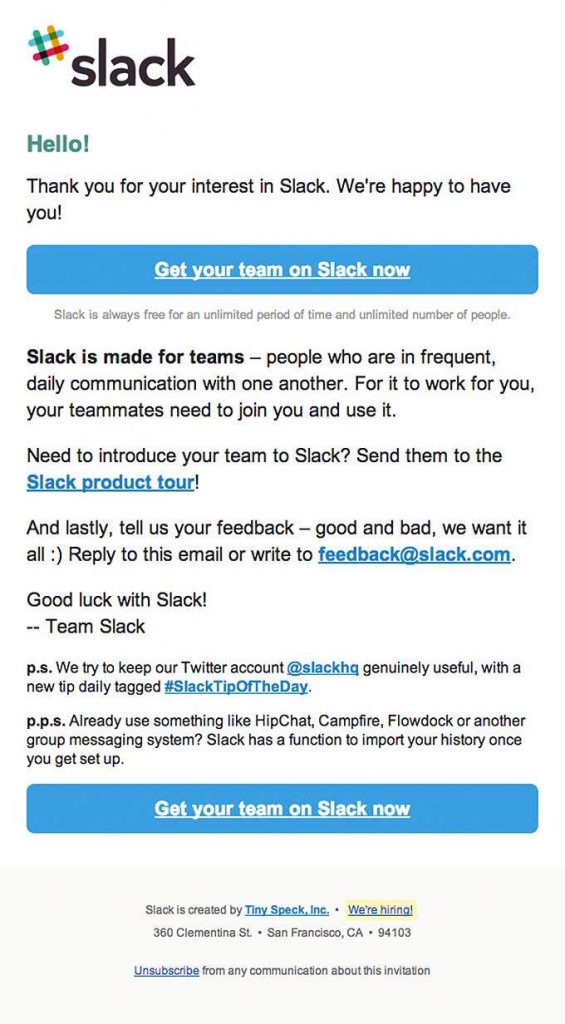
In contrast to HubSpot, Slack uses a simpler and shorter design. However, it still conveys a lot of information.
The point of the email is to get the user started as quickly as possible, with one very prominent CTA. It also sets up a friendly tone and lets people know who to reach out to provide feedback. Finally, it sneaks in a Twitter plug, to let the user know where to find more information.
Although deceivably short, this email packs a ton of information that’s relevant to the user.
Learn from it:
Even if you don’t have amazing visuals, you can still pack a lot of info in your messages. The trick? Make it relevant to your users.
If you’re only informing your users about what they need to know, they’ll gladly read the whole message.
3. Miro
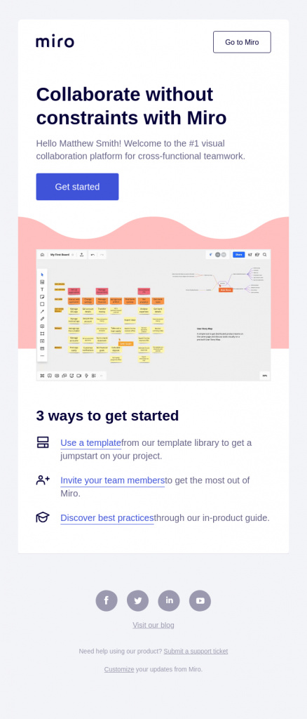
Miro uses a surprisingly slim welcome message. In it, Miro is looking for one thing: to get users started on their onboarding. It achieves this with an email that takes only seconds to read in its entirety so users can begin learning as quickly as possible.
Learn from it:
Your email doesn’t always need a long introduction to your company. Instead, you can begin the learning for the next step of the onboarding with a quick email, to get your users started as fast as possible.
4. Wufoo
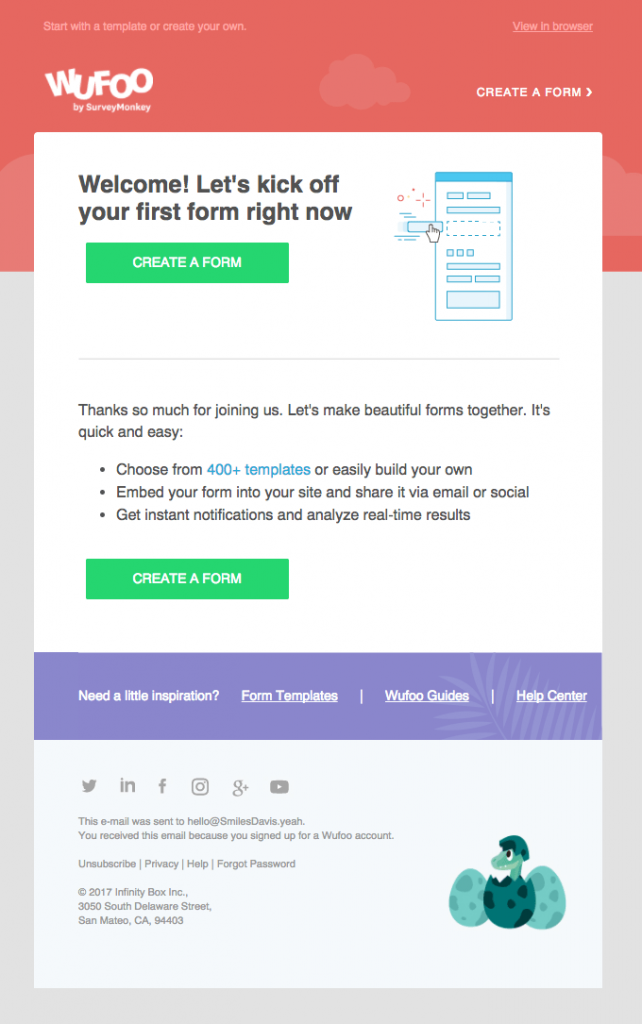
This welcome email by Wufoo is meant to lead users to create their first form. That’s why it repeats the same CTA twice, first at the top, then again after quickly introducing their best features.
Learn from it:
If there’s only one next step for your users, make it the main point of your welcome email. By focusing on only one step, you can write content to lead your users to take it, kickstarting their onboarding process.
5. Whereby
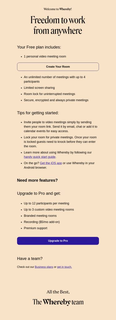
This flat design by Whereby is extremely effective at captivating people’s attention and retaining it.
With no extra visuals, the email ends up looking clean and uncluttered, helping users concentrate on the content.
Learn from it:
The lesson is clear: keep it simple. The simpler you can keep it in one area, such as the graphics, the more complex you can go in other areas, like the text.
Balance your overall design to make sure it’s simple and engaging.
6. Asana
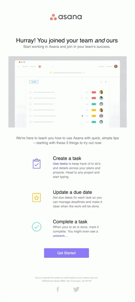
This email’s main feature is its animation. With it, Asana grabs its users’ attention, making the whole email more visually appealing. By featuring at the beginning, Asana also gets people interested right from the start.
Learn from it:
Visuals can be very important in a welcome email. Use them to provide a visual break between the text, and to help highlight your main points.
7. Shopify
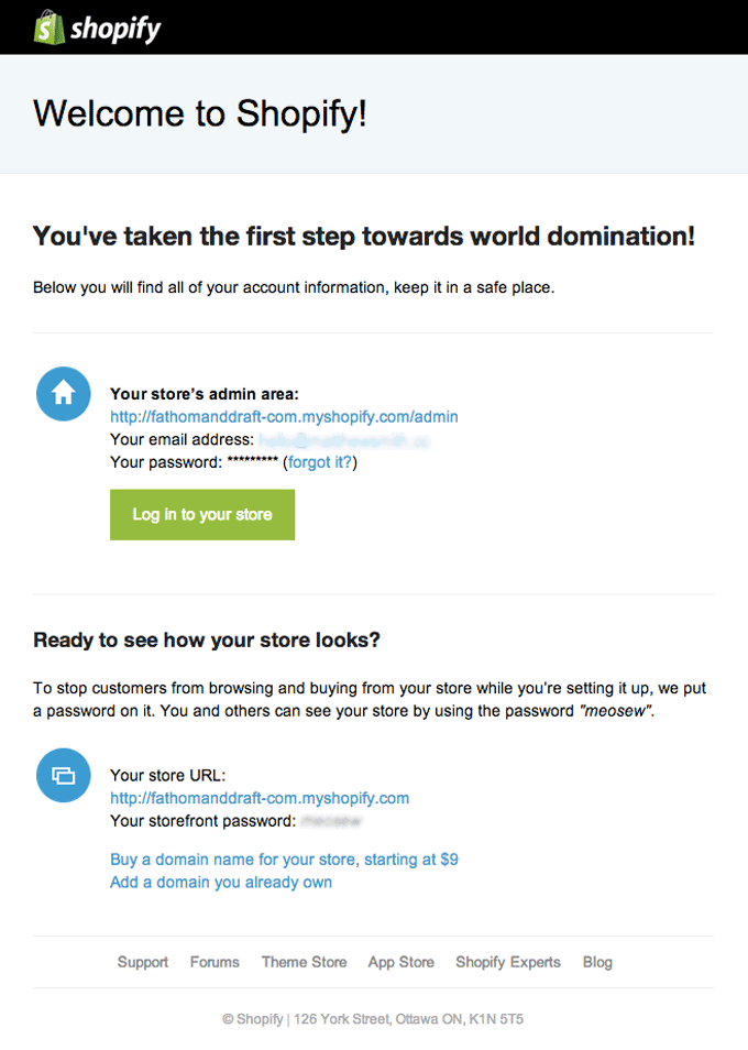
Although it uses a seemingly simple and common email, Shopify makes this welcome message memorable with a playful sentence: “You’ve taken the first step towards world domination!”
By placing this message at the top, the sentence pops out and makes a huge impression on the user, enticing them to keep reading.
Learn from it:
It’s always a good idea to make your welcome email as memorable as possible. You don’t have to work too hard to do this. A simple playful sentence in bold text can pop out and set the tone you want to convey.
Mobile Apps: Welcome Message Examples
Here are some examples of how mobile apps welcome their users:
8. Headspace

Headspace keeps things simple with one very prominent CTA that’s ready to be clicked. However, after the CTA, the email continues with more information for those wanting to know more about their onboarding before clicking away.
Learn from it:
You may want to use your welcome email as the bridge between the signup and the onboarding. That’s great for people who are looking to start right away but not necessarily for everyone.
It’s a good idea to place your CTA prominently to get users started immediately, but compliment the email with more information for those looking for more.
9. Blinkist
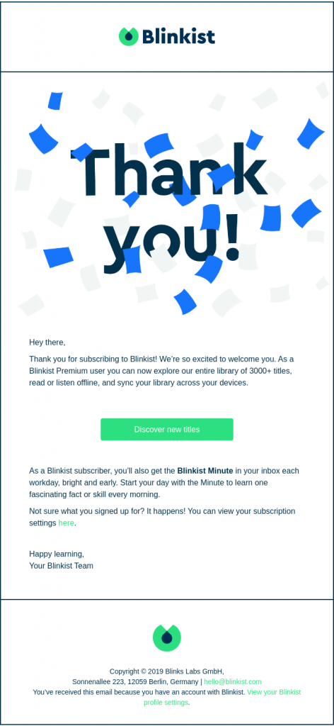
The main message of Blinkist’s email is very clear: to say thank you. With it, Blinkist makes sure to let users know just how appreciated they are and how much the company values them.
Although it’s followed by a CTA for onboarding, this only comes after the user has been thanked, so it almost feels like a secondary purpose in this email.
Learn from it:
Although marketers tend to only see numbers for engagement, they often forget that each of those numbers represents a real person, and people certainly do not want to feel like just another number.
Standing out from your competition through excellent customer service is always a great idea that costs barely anything, but pays off quite well.
10. Lift

This email’s purpose is simply to get the user to take their first ride. That’s because this is the next logical step for their users. Most users sign up exclusively to take a ride immediately, so there’s little point engaging with unnecessary content about the company or the prices.
Learn from it:
It’s vital to know when the user will receive their welcome email so you can engage them. Know exactly what your user wants to do immediately after they receive your welcome message, and make it easy for them to do it.
11. Spotify

This welcome email reaches users once they have signed up for the Premium tier of Spotify. Users that have chosen this level are likely to know the platform well, so Spotify, instead of introducing the platform, uses this email to introduce the new things user can do.
Learn from it:
If your welcome email is meant for a user who already knows your platform, focus on the features and the new things they can do with it. Treat it like a prize, and let them know everything they can use that prize for.
12. Uber
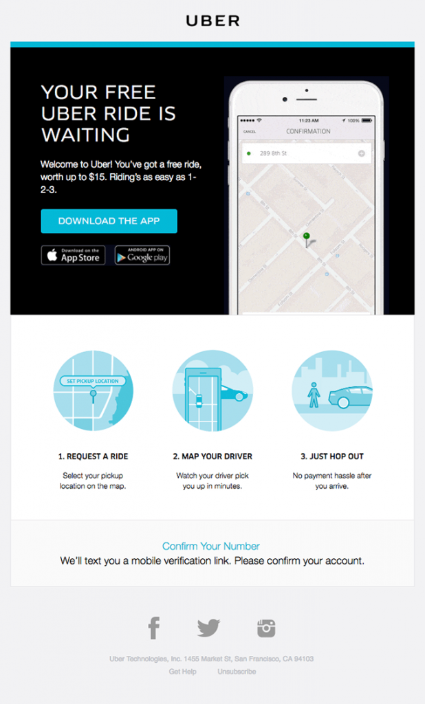
This welcome message by Uber is meant to quickly onboard a new user. However, it doesn’t open with the features or the process, it opens with an invitation to take a free ride.
The wording makes it look almost scarce, inviting the user to get started immediately, for free.
Learn from it:
We all like free stuff. If you have a free trial, a free account, or any other freebies, you can wisely use those to get users to convert and start using your solution.
13. YouTube
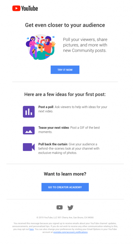
In this welcome message by YouTube, users are given ideas for their first post. This enables them to imagine what they would do if they wanted to transform an idea into reality, giving them a long-lasting impression.
Learn from it:
Stimulate your users’ creativity whenever you can. Instead of giving them solid examples, give them ideas of what they can do so they can imagine the examples for themselves.
Online Services: Welcome Message Examples
Here are the best welcome emails sent by online service companies:
14. Indeed

Indeed’s onboarding process is fairly long and involves multiple steps for the user to get their resume uploaded, updated, and posted, so they can look for a job that suits them. This is why the email not only includes a call to action but also lets the user know in advance which steps they’ll need to take.
Learn from it:
Set up expectations from the start. Just like you’d tell your users how long a survey would take, you can also let them know how long their onboarding experience will be. This will prepare them mentally for what’s to come.
15. Netflix
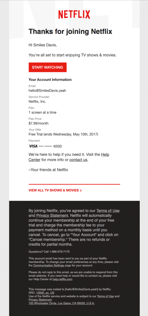
Netflix sends this welcoming email after a user has signed up to the platform for free. In this email, Netflix lets them know how much they’ll pay and when their free subscription will end, so users will have a clear understanding of the expenses as they move forward.
Learn more:
If your welcoming email isn’t going to launch an onboarding, you can still find relevant information to send to your audience. Setting the record straight about what users will need to pay and including when and why payments will be required is a great way to avoid future miscommunications.
16. Airbnb

Airbnb’s main pitch is to get people to stay in different places, not just visit them. This is achieved by a fairly personal relationship between the renter and the guest, which often begins in person. Airbnb reinforces this by welcoming the user not to the platform, but to its community, with images of people having adventures together.
Learn from it:
We all want to feel like we belong. If you have a fairly strong community, or if you provide excellent customer service, you can leverage it by making new users feel like they are part of the community you’ve created for them.
17. Disney+

The Mandalorian is by far Disney’s most popular show on its platform. That’s why, in this welcome email, Disney+ puts the show front and center—because they know their users are likely to begin their subscription by watching it.
Learn from it:
You can’t show off all of your features and benefits in your welcome email. Instead, use data-driven decisions and ample testing to find out what works best, then focus on showcasing these items.
18. Just Eat
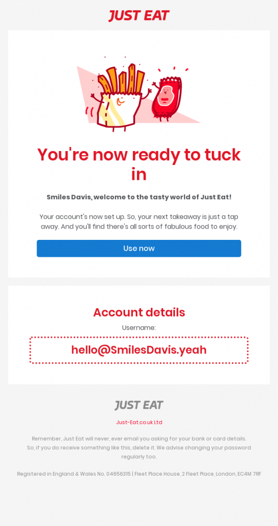
Just Eat sends its new users this welcome email adorned with cute mascots. However, the best thing this email does is address the user by name in both the email and in its subject. This allows for a more personal touch that can help you improve customer perception.
Learn from it:
It’s well known that addressing your emails to the user’s name can increase open rates by up to 35%. Collect names at the beginning of your process and use them often in important emails to quickly personalize them and engage your users.
19. NordVPN
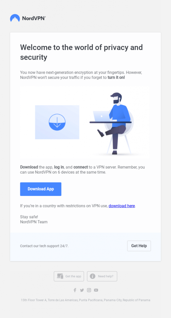
NordVPN is well-known by anyone who watches YouTube videos since they sponsor a lot of creators. That’s why this email, besides remaining simple and to the point, is developed to look great on all devices—mobiles, tablets, or computers.
Learn from it:
These days, more people check their emails on their phones instead of their computers. However, you may develop your marketing emails using a computer, so it’s extremely important for you to ensure that they’re mobile-friendly.
Always look at your emails’ design from your mobile phone, and test every email before sending it.
Bonus: 3 Chatbot Welcome Message Examples
Here are a few great chatbot welcome message examples to inspire you:
20. Messagely
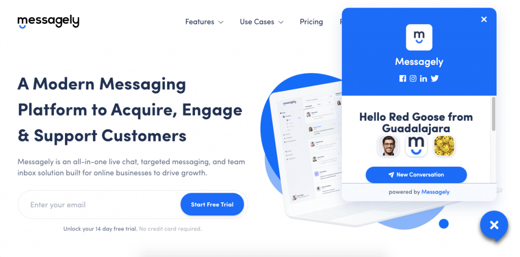
Messagely’s powerful chatbots allow for great customization with little information. The chatbots check the user’s location and use it to personalize their welcome emails, creating the perfect custom experience for each user.
Learn from it:
The more powerful your chatbot is, the better revenue it’ll give you. Luckily, Messagely’s chatbots are available for you to use. There’s no need to know how to code either. You can quickly set up powerful chatbots in just minutes, letting them work 24/7 for you.
Find out more about what you can do with chatbots today.
20. HubSpot
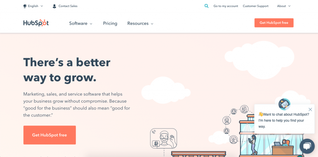
HubSpot is great at what it does, and this includes marketing. Its chatbot is as unintrusive as it can be while making sure all users see it in case they need anything. With a simple offer to help, HubSpot makes sure all users know where to ask questions.
Learn from it:
Balancing between being prominent enough for everyone to see your chatbot, while being unintrusive enough to let people navigate comfortably, can be tricky.
Often, less is more. Use an emoji or two and a couple of lines of dialog, and make sure you feature a clear close button to balance those two things perfectly.
21. ServiceNow
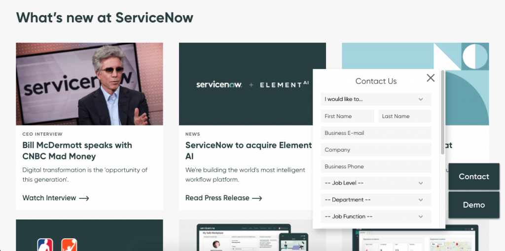
ServiceNow’s chatbot doesn’t appear until you scroll down the page. When you click on it, you’re shown a contact form where you can fill in your information to get the help you need.
Learn from it:
Chatbots can be powerful lead generators, as long as you get the right information from your leads to start. Make sure you get as much data as possible so you can reconnect with promising leads later.
22. ContactOut

The purpose of this e-mail from ContactOut is to get the user started on using the tool. The CTA at the top allows users to get more information about product, so they can use it with confidence. There’s another CTA at the bottom of the page that guides users to download the email finder extension so they can use the tool with just a few clicks.
LEARN FROM IT:
When creating your CTA, be sure to keep it concise and easy to follow. Use clear language and make sure the button or link stands out from the rest of the text. And most importantly, test it to make sure it’s working correctly.
Conclusion
Welcome messages are a vital part of your customer onboarding process, and they play a very important role in your overall sales funnel.
If you make them memorable, interesting, and easy to read, your users will not only read them but may even look forward to your next message.





 Instagram